Deconstruction point 1: Design requirements definition
The design definition of this product is probably based on a user portrait designer who found some relatively young and fashionable user groups such as Ouyang Nana and Chen Yihan, and made some product definitions based on the user portraits.
The first design concept is that the designer hopes to express the concept of health and environmental protection;
The second is that the designer hopes to do a childish but not naive modeling language style;
The third color, the color designer proposed to do colorful color attributes;
The fourth is experience design, the designer proposes hidden delicate care;
Designers have defined related products from four dimensions. Next, we will disassemble some design thinking that is specifically implied in the product around the definition of designer products.
Deconstruction point 2: Vitality Appearance design: childish but not naive
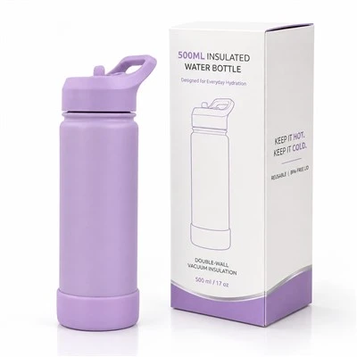
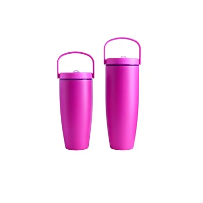
The first one is its appearance. In fact, the designer has proposed to do a childish and not naive modeling language when the product is defined. In fact, when we are learning product modeling, we actually learn some techniques. Straight lines, curved lines, what kind of language can be expressed. In fact, some large arcs and large rounded corners are adopted here. The designer deliberately enlarges the seams of this piece and adopts large rounded corners, which will have such a childish feeling, but will not be naive. In terms of the design of the shape, the final result is actually able to present the definition of the designer (the original product);
Another is the following words, the designer used some textures similar to those on Roman columns. This texture actually has two considerations. The first one will present a more delicate visual perception; the second one is its tactile feel, which can better ensure grip and friction when you get this prismatic shape in your hand;
Deconstruction point 3: Vibrant and colorful sensory experience
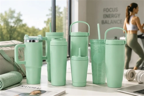
Let's deconstruct it further down is its color, the designer proposed that we must convey colorful ideas. Therefore, the designer divided the entire material of the cup and made a split. The bottom part is the texture of silicone, the middle is the transparent color of glass, the top part is plastic, with delicate bite flowers, the whole material is matched Above, showing a very rich sense of hierarchy. The other is color, you can mix and match as you like, just like the cup is a palette. You can freely match the color of the silicone below, including the color of the cover. You can mix and match thousands of colors at will, giving users more of this color sensory experience. This is a design consideration for color and material.
Deconstruction point 4: unconscious experience design: hidden delicate care
The fourth point is that the experience designer summed up a sentence called hidden delicate care
The first one is the mouth of the cup. The mouth of the cup adopts a triangular water outlet. Because the water has tension, the size of the water will be uneven. The triangle can destroy the tension and make the water more uniform. In fact, what is this? , the user of this design can't actually see it, but when he is drinking water, he can feel this experience, so this is the first experience of the design,
The second is the position of the water outlet. The designer has carried out a combination of bright and matte surfaces. The part of the mouth that often touches the drinking water is treated with a bright light. When drinking water, the contact area is not easy to leave stains. , take care of it, clean it up, etc.
It will be more convenient to wait. This is to use a material with a bright and matte surface to give another good experience.
The third is that the opening and closing of its lid actually has a small design consideration. When making the cover, he deliberately made a very exaggerated shape of the buckle, with a mouth shape on the front, he made the sound of the buckle more crisp, we often feel a little unconscious, let's pinch some bubbles and pinch some Things produce sound, and the designer hopes that you will wake up or stimulate your unconscious movements during the process of opening and closing the cup. The designer calls it the refreshing opening and closing experience, which is also a design of a small experience.
The last one is better thermal insulation design. In addition to the prismatic shape on the outside, the silicone sleeve at the bottom actually has a small design inside, we can open it, and it actually adopts a prismatic structure inside. It will form a lot of empty walls, or a space between it and the bottom of the cup. In fact, it has a better thermal insulation effect. It is actually a very good hidden design. It will bring you a very good experience. It is better than ordinary silicone with uniform wall thickness.
There is no LOGO on this cup. They want to provide a good drinking experience. He does not need to display the LOGO, and whoever produces the cup does not need it. He actually printed a sentence in the cup, and finally I ended with this sentence, Drink to make a difference is actually creating or changing the world or exploring boundaries, conveying positive energy to users, and at the same time comparing it to one of their companies. Values, I think this is a really great product and recommend it to everyone.